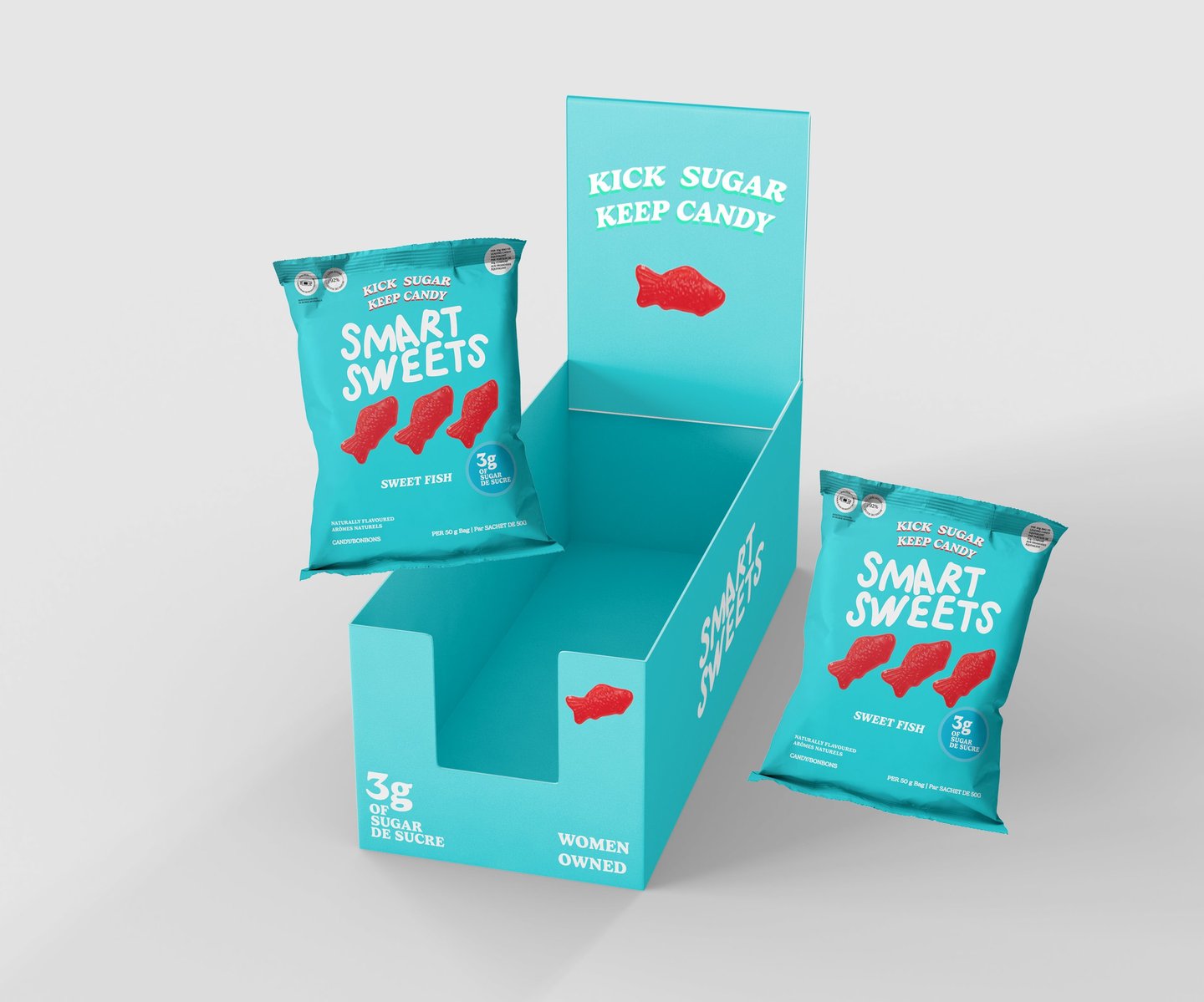
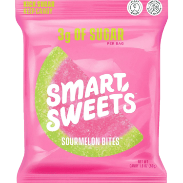
For my packaging design assignment, I redesigned SmartSweets’ Sweet Fish and Sour Melon Bites packaging to improve readability and visual hierarchy while maintaining the brand’s bold, playful aesthetic.
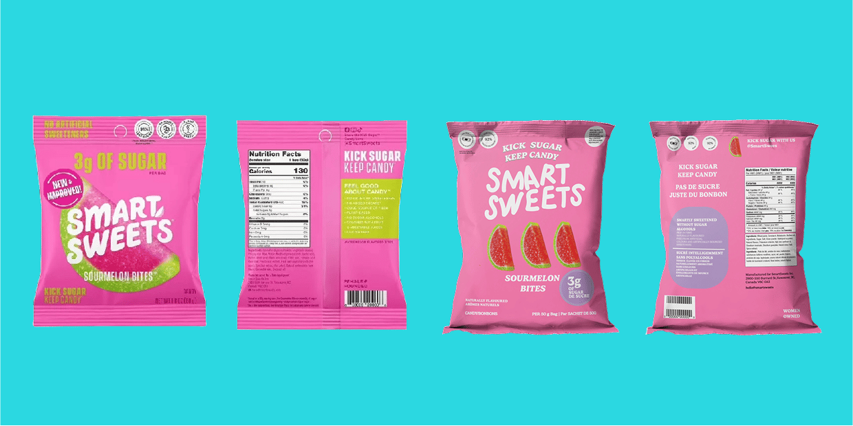
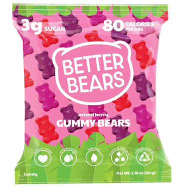
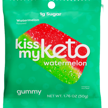
I conducted a competitive analysis of SmartSweets, Kiss My Keto, and Better Bears, focusing on low-sugar candy brands with similar color palettes and target audiences. While SmartSweets has strong shelf appeal, I found opportunities to improve clarity and hierarchy.
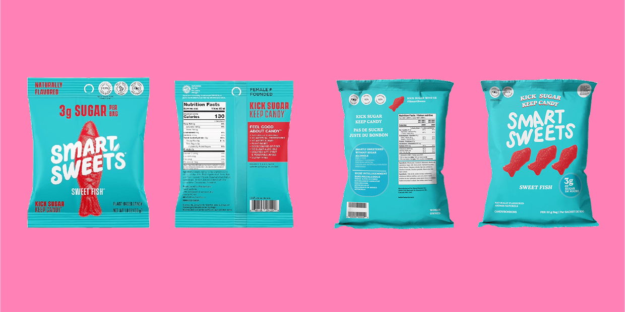
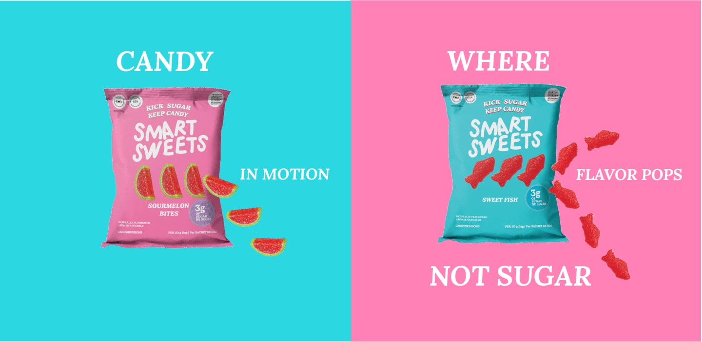
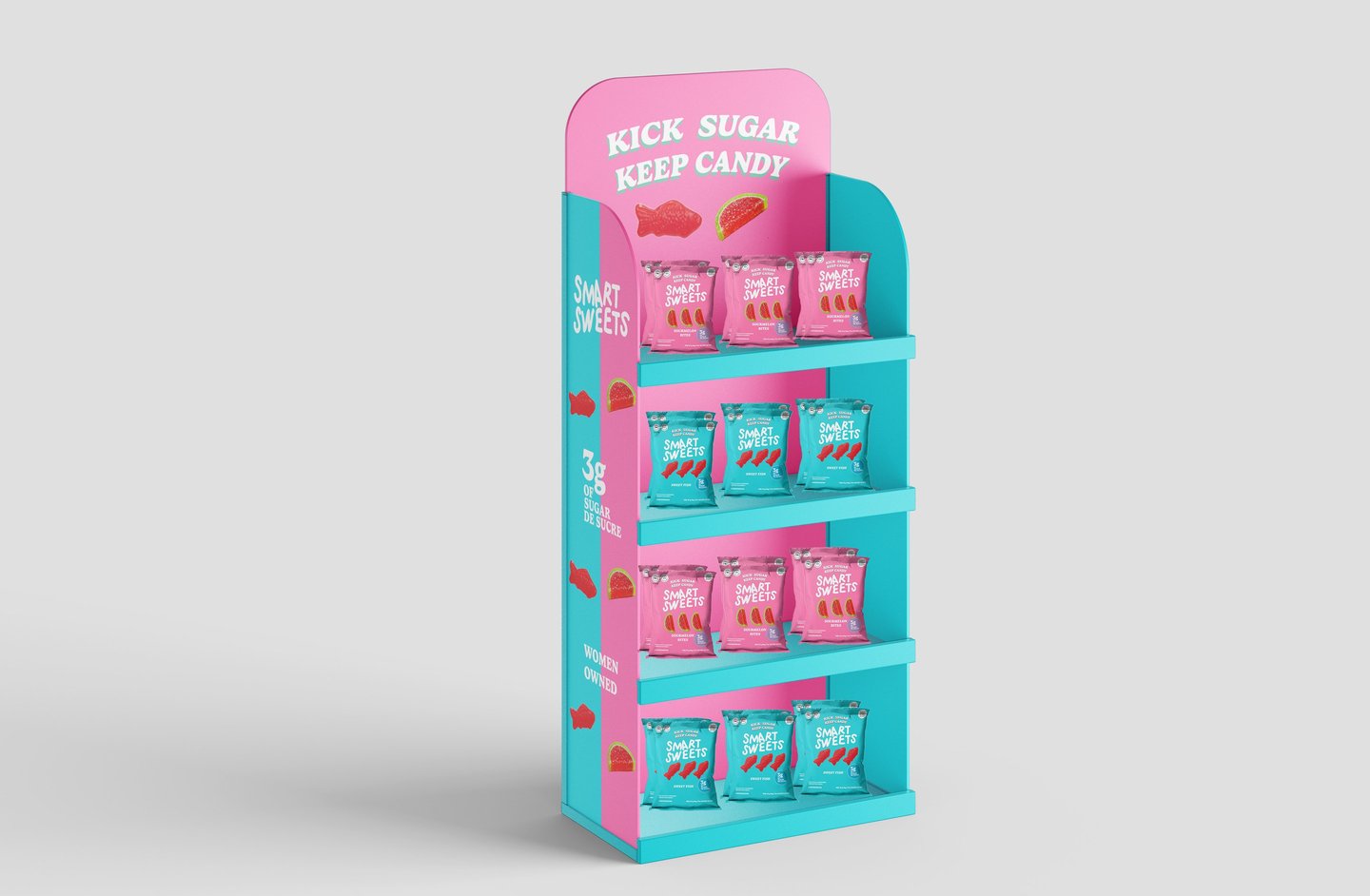
Based on these insights, I adjusted the flavor imagery to create more space for text, repositioned “Kick Sugar – Keep Candy” for better visibility, and moved the logo above the “3g of sugar” callout to strengthen brand recognition. I added three watermelons to the center to create visual rhythm and emphasize flavor. I also refined the layout using a packaging template and updated the “3g of sugar” badge and nutritional label for better readability and cohesion.
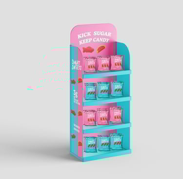
The final redesign balances imagery and text while preserving the brand’s playful identity. I was especially drawn to the idea of the sweets “jumping out” of the packaging and envision extending this into an energetic ad campaign that adds movement and dimension to the brand.
Original Packaging
Final Packaging