Miniature Packaging Design in the Beauty Industry
A blog exploring miniature beauty packaging—where design, function, and experience meet in small-scale formats.
6/4/20263 min read
I’ve always been obsessed with miniature objects, so when I started noticing miniature beauty packaging, I got genuinely excited. Miniatures and beauty packaging—what more could a creative girl ask for? It’s one of those things I didn’t just want to admire, but actively study. Lately, I’ve found myself constantly looking at mini packaging whenever I come across it. I pay attention to how it’s designed, how it’s made, how it attracts customers, and how it functions in real life. Accessibility in packaging is something I think about a lot. A product can look amazing and convince me to buy it, but if it’s hard to open or frustrating to use, it quickly loses its value.
I’ve realized I usually think about four key things when buying a product: the actual benefit of it, the price, the design, and the accessibility of the packaging. Design is usually what pulls me in first, but usability is what determines whether I actually enjoy the product long-term. I also feel like miniature objects are becoming more popular right now, which makes me happy because it opens up more space for creative exploration in smaller formats. There’s something really interesting about how much information and personality can be packed into something so small.
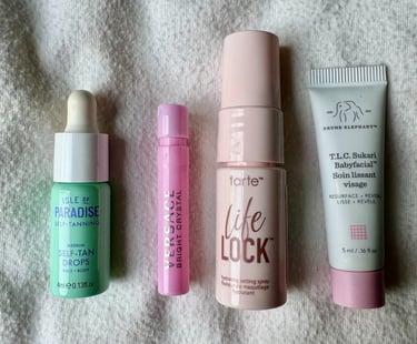
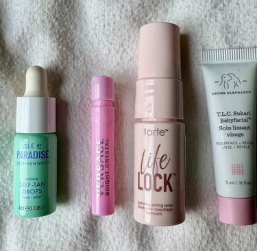
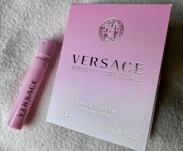
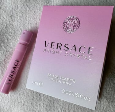
Some of my favorite examples come from beauty samples and travel-size products. I loved the mini self-tanner from Tan-Luxe I got from Sephora—it was so small, cute, and perfect for throwing in a makeup bag. I also received a mini Versace perfume, and I loved everything about it—the size, the color, and the packaging it came in.
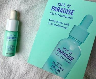
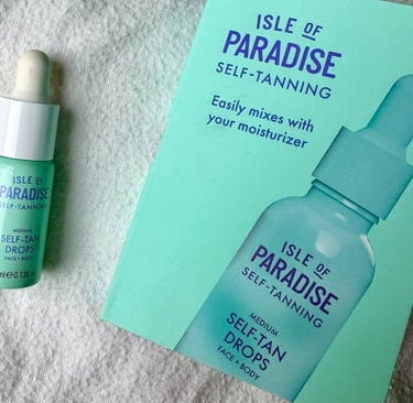
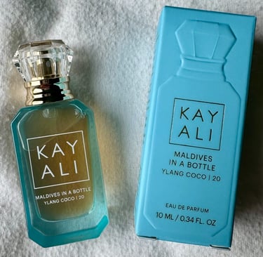
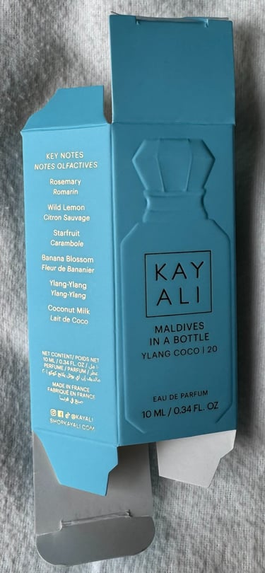
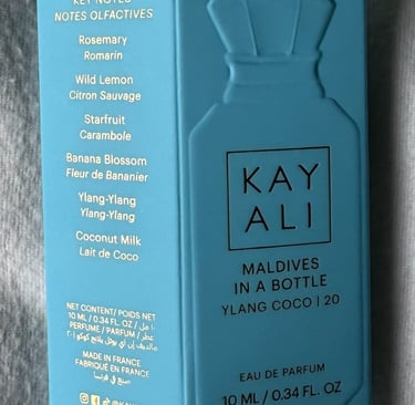
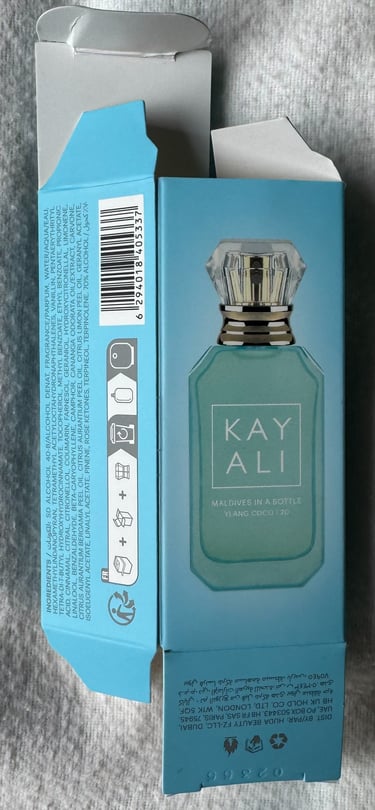
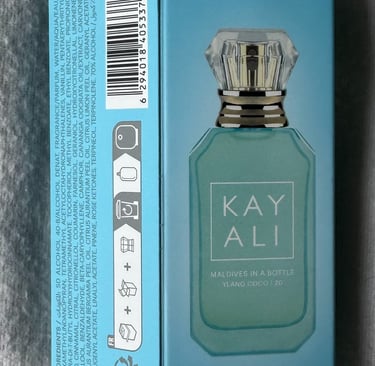
What I really appreciate is how much detail designers manage to fit into such small spaces. Even with limited room, there’s still strong hierarchy, thoughtful typography, and clear branding. I especially love color combinations like light blue with gold typography. I’ve also noticed brands like Kayali using a geometric sans-serif typeface similar to Neutra or Neutraface, which gives the packaging a clean, elevated feel.
Functionality is usually well thought out, but sometimes miniature packaging can be slightly difficult to open without damaging it, which takes away from the experience a bit. Still, I love small details like when the outline of a perfume bottle is printed on the box—it adds something visual and instantly recognizable.
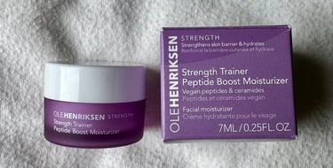
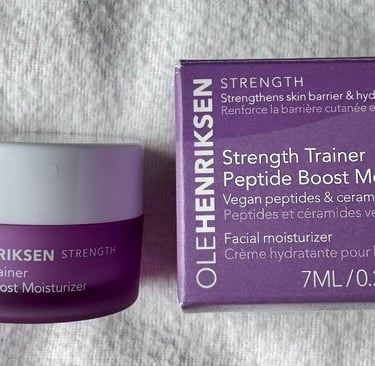
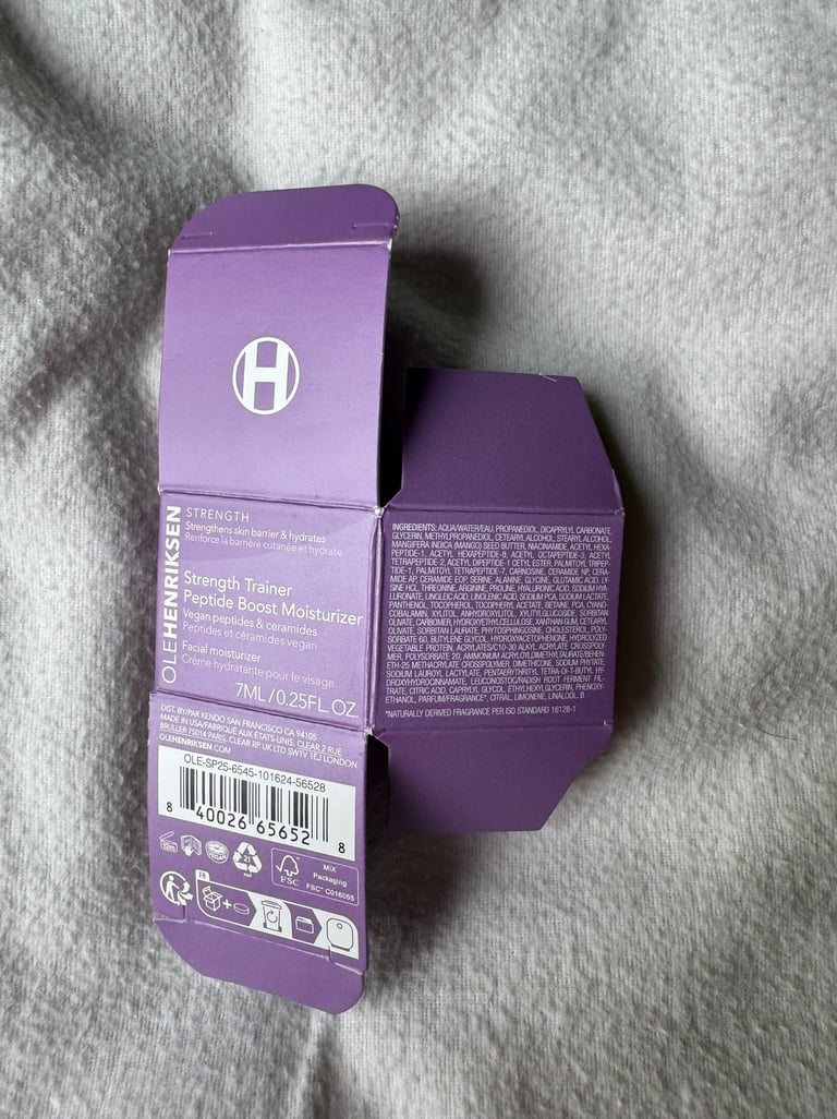
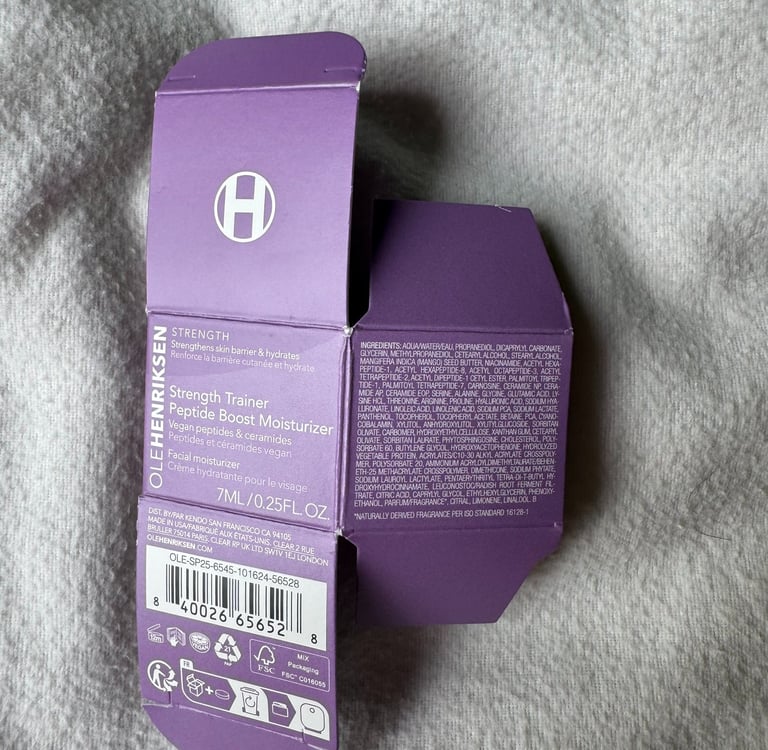
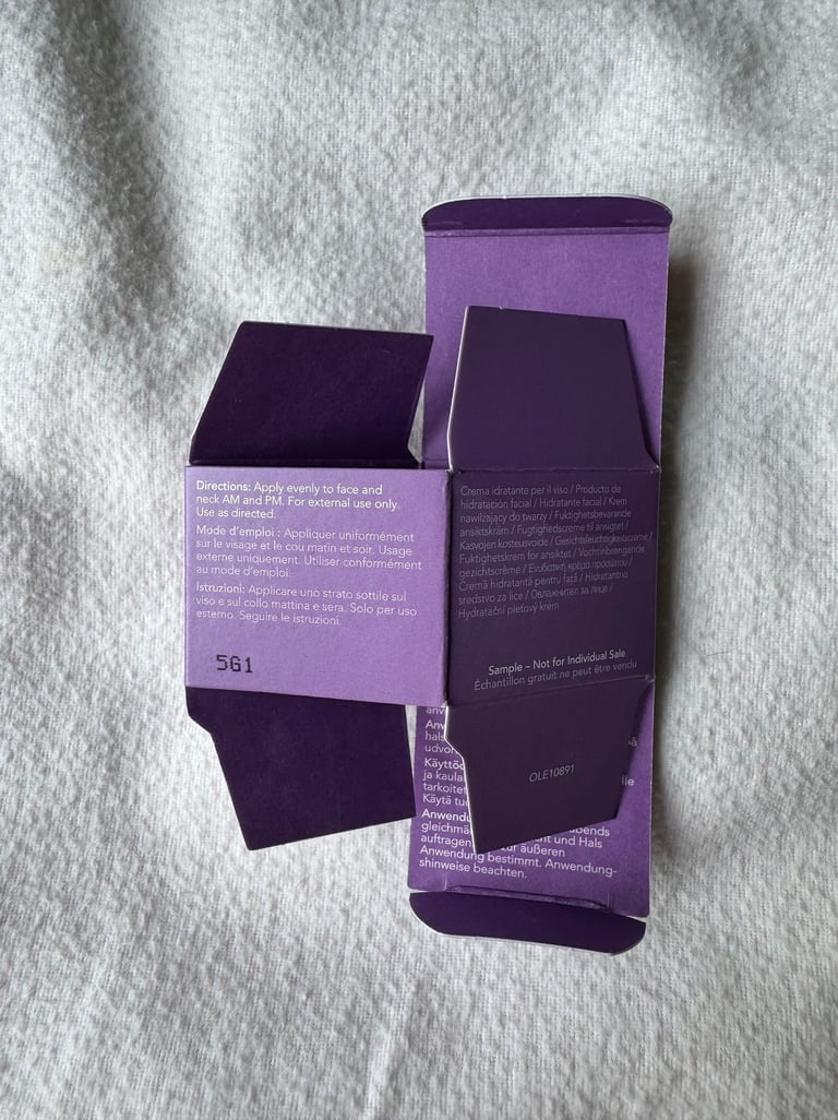
I also really like Ole Henriksen sample packaging because it’s simple, cute, and easy to use. Everything fits perfectly, and the design feels really aligned with the brand. Nothing feels overdone, but it still stands out.
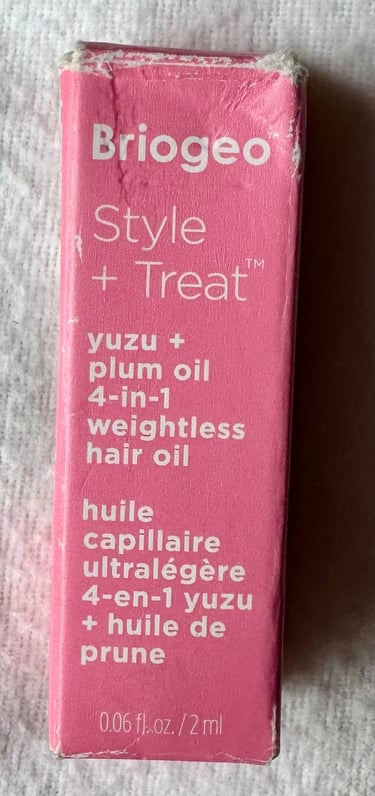
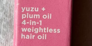
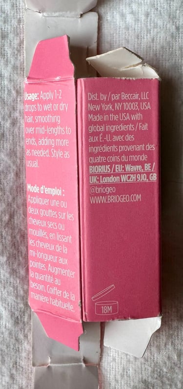
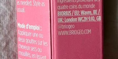
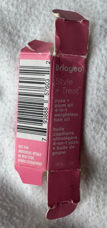
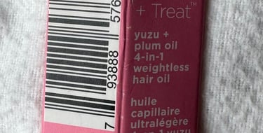
And Briogeo’s pink mini packaging is another favorite of mine. It’s small, easy to open, and visually satisfying. The pink and white color palette is simple but effective, and it fits perfectly in your hand—which honestly adds to the whole experience.
Overall, I think miniature packaging is more than just a cute trend—it’s a really interesting intersection of design, function, and experience. It forces designers to be intentional with every detail, from typography to structure to usability, because there’s no extra space to hide anything. For me, it’s become a way of thinking about design on a smaller, more thoughtful scale, and it makes me even more excited to keep exploring how creativity can exist within constraints.