

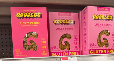
Over the past few years, I’ve noticed a big rise in color-block packaging—especially in beauty, but also in food. A lot of my own design inspiration comes from everyday moments, like walking through the pharmacy or grocery store. I’ll catch myself being drawn to certain products purely because of how they look. Even without knowing anything about the quality, the presentation alone can make me want to pick something up. That’s why I think packaging design is so important. If your product visually stands out on a shelf full of similar items, you’ve already won half the battle.
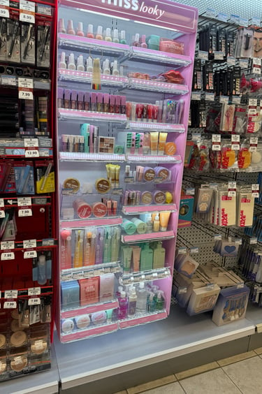
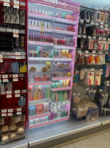
For example, when I look at something like the Miss Looky display in picture above the displays right next to it feel really bland and easy to ignore. The pastel tones, lighting, and variation in shades immediately draw my attention to the Miss Looky display—it’s where my eyes naturally go first.
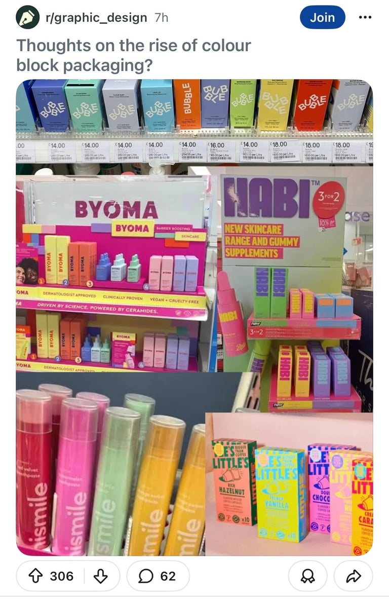
I was scrolling through Reddit when I came across a post that got me thinking about how packaging design has been changing, and what actually stands out to customers today.
Reading through the Reddit comments, there were a lot of mixed perspectives. Some people said the designs are cute and eye-catching, while others felt that if every brand adopts this trend, it starts to blur together and loses a sense of strong, individual branding. A few people mentioned that newer brands might be using these colors to experiment and find their audience—especially trying to connect with younger consumers on platforms like TikTok.
There was also an interesting discussion around whether these designs are specifically targeting teens. Some people agreed, while others pushed back and said it’s not just teens who are drawn to bright, playful colors. With how much social media has influenced beauty and skincare, it does feel like younger audiences are more engaged than ever—but at the same time, color and design can be universally appealing.
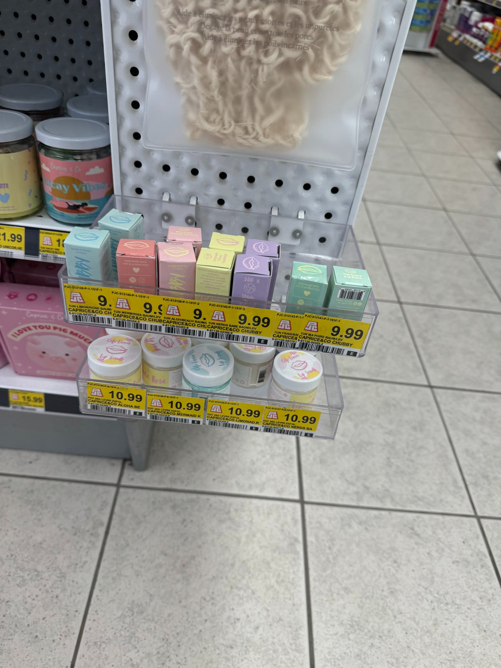
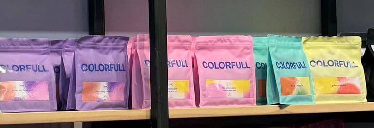
Pictures by Zoe Montenegro-Mackenzie taken in Montreal, QC
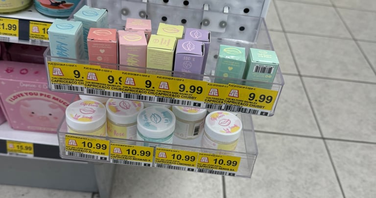
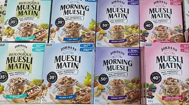
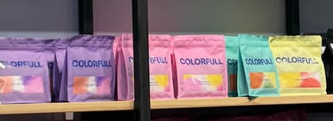
Pictures by Zoe Montenegro-Mackenzie taken in Montreal, QC
Something else I find interesting is how packaging might appeal differently across generations. I could be wrong, but I imagine my parents’ generation (late baby boomers) might not be as drawn to bold color-block designs. It might feel less intuitive or even overwhelming. I tend to think they prioritize practicality and price point more, whereas millennials and Gen Z are often more influenced by presentation, aesthetics, and that “extra” visual appeal.
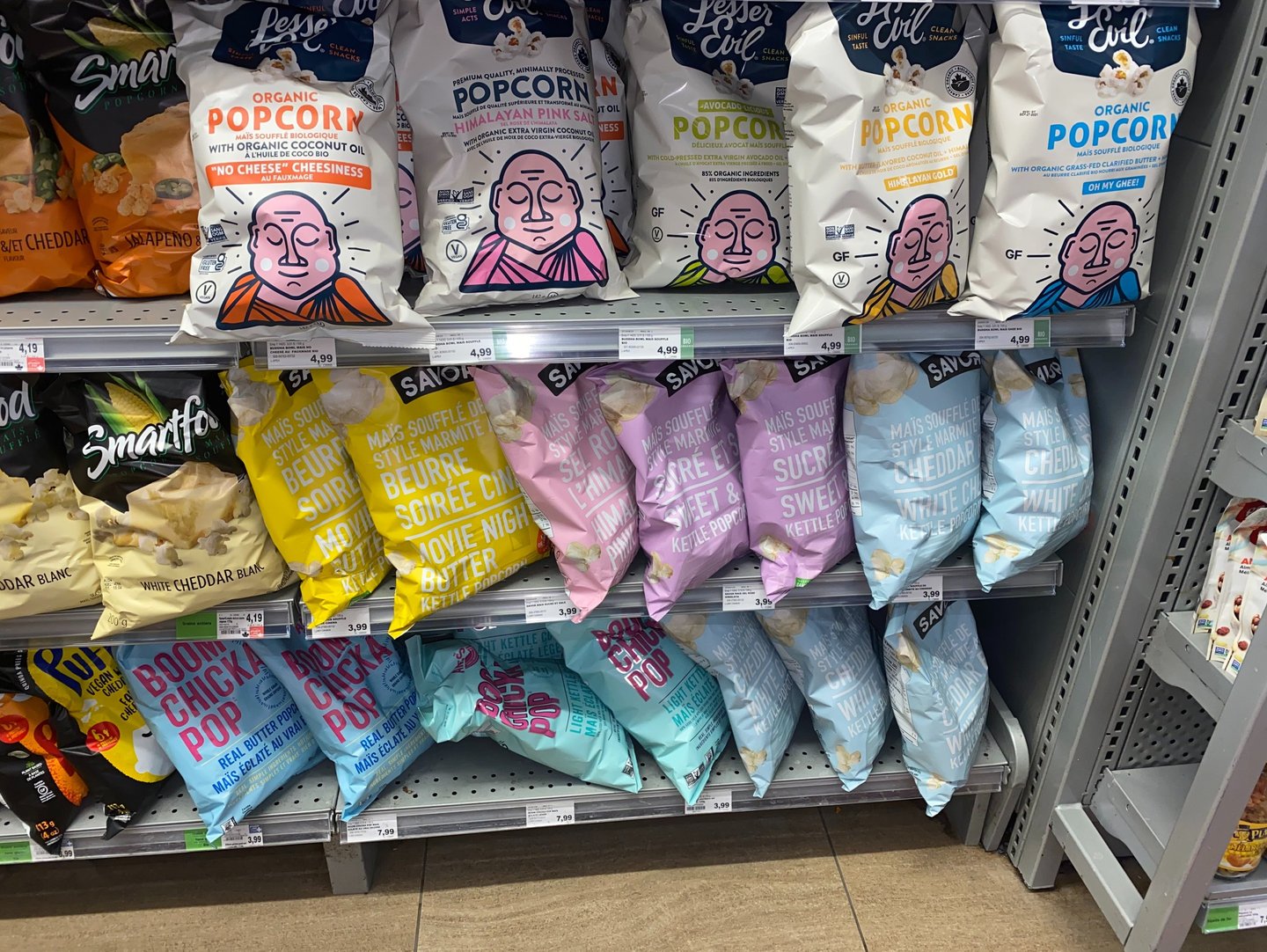
Going back to the reddit post, one comment that stuck with me mentioned how, with everything going on in the world, bright colors can feel uplifting—like a small reminder of lightness. I thought that was really interesting. While color-blocking and pastels are especially prominent in beauty, I’ve definitely been seeing them more in food packaging too. It makes me think: people want to enjoy what they’re buying, not just use it. The experience starts before the product is even opened.
So I’m curious—what stands out to you in packaging design? What kind of presentation actually makes you stop and consider buying something?