A Comparison of American and European Design
Exploring Parisian Advertising
By Zoe Montenegro-Mackenzie
3/25/20252 min read


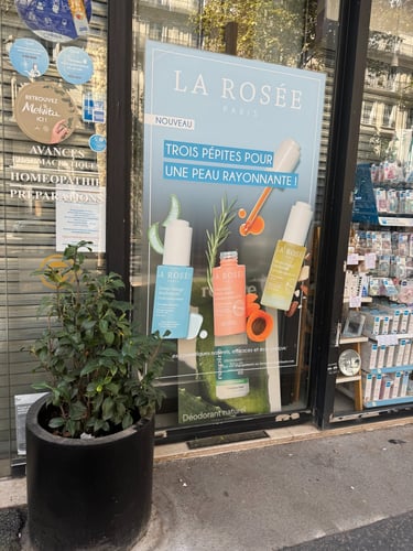

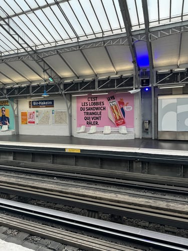
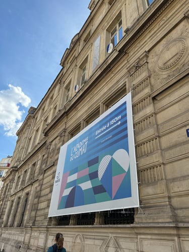
When I visited Paris this summer, I noticed that advertisements there had a very different design approach compared to those in North America. Intrigued, I took pictures to reference them and later did some research to better understand the differences. What stood out to me the most was how much more subtle and understated Parisian designs were—they felt less "in your face" than the ones we see here. Even just looking at the ads I photographed, I was drawn to their color palettes. They had this soft, almost effortless elegance that made them feel refined rather than overwhelming.
While reading an article on LinkedIn by graphic designer David Cox, I came across an interesting perspective. From his personal experience after moving from Europe, he noted that “European design tended to be more understated and cleaner, with minimal type usage and illustrations, mostly using sans-serif typefaces. By contrast, American designs were type-heavy, often using copywriting-led communication with photography and serif typefaces” (Cox, 2016).
In another article, Kevin Smith discusses how Americans often perceive European design as more sophisticated, yet much of European design has actually been strongly influenced by American culture. He explains that this cultural exchange dates back to historical conflicts such as the American Revolutionary War, the War of 1812, and World War I, which shaped the way products and media were exchanged between America and Europe. Closer to the 20th century, he notes that “The United States lost a bit of its luster. American power began to appear unseemly. Europeans became snottier, and American foreign policies were less and less appreciated” (Smith, n.d.). This is an interesting lens through which to examine how design in America and Europe has influenced each other over time.
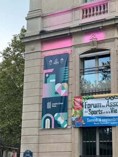
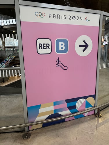
While in Paris, I was also struck by the ads and designs for the 2024 Summer Olympics—it was beautifully executed, reflecting a balance of modern aesthetics and national identity. This experience, along with my research on Parisian advertising, got me thinking about how design varies across cultures.
Later, when I met with one of my design mentors, I shared my observations and research questions, which led to a discussion about how design processes differ across countries. She lives in Armenia and explained how she often has to adapt when applying for jobs in different regions, adjusting her approach based on local design preferences and industry expectations. It made me realize how crucial it is to understand these nuances when considering working abroad. If I were to move to Paris, for example, I would ask: How can I better prepare for my role? What design practices should I familiarize myself with beforehand? And what would be the best way to immerse myself in the local design culture and gain a deeper understanding of the aesthetic preferences in Paris?
References
Cox, David. 2016. "Does the European Design Aesthetic Still Exist?" LinkedIn, August 5. https://www.linkedin.com/pulse/does-european-design-aesthetic-still-exist-david-cox/.
Smith, Kevin. n.d. "America vs Europe – Who Has The Best Designs?" SmashBrand. https://www.smashbrand.com/articles/america-vs-europe-who-has-the-best-designs/.
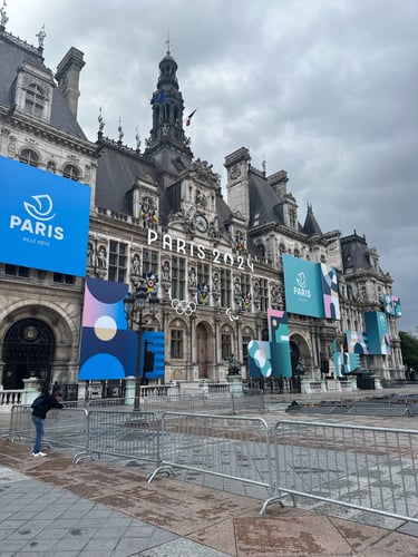
Paris 2024 Olympic Ads and Designs
Paris 2024 Advertisements